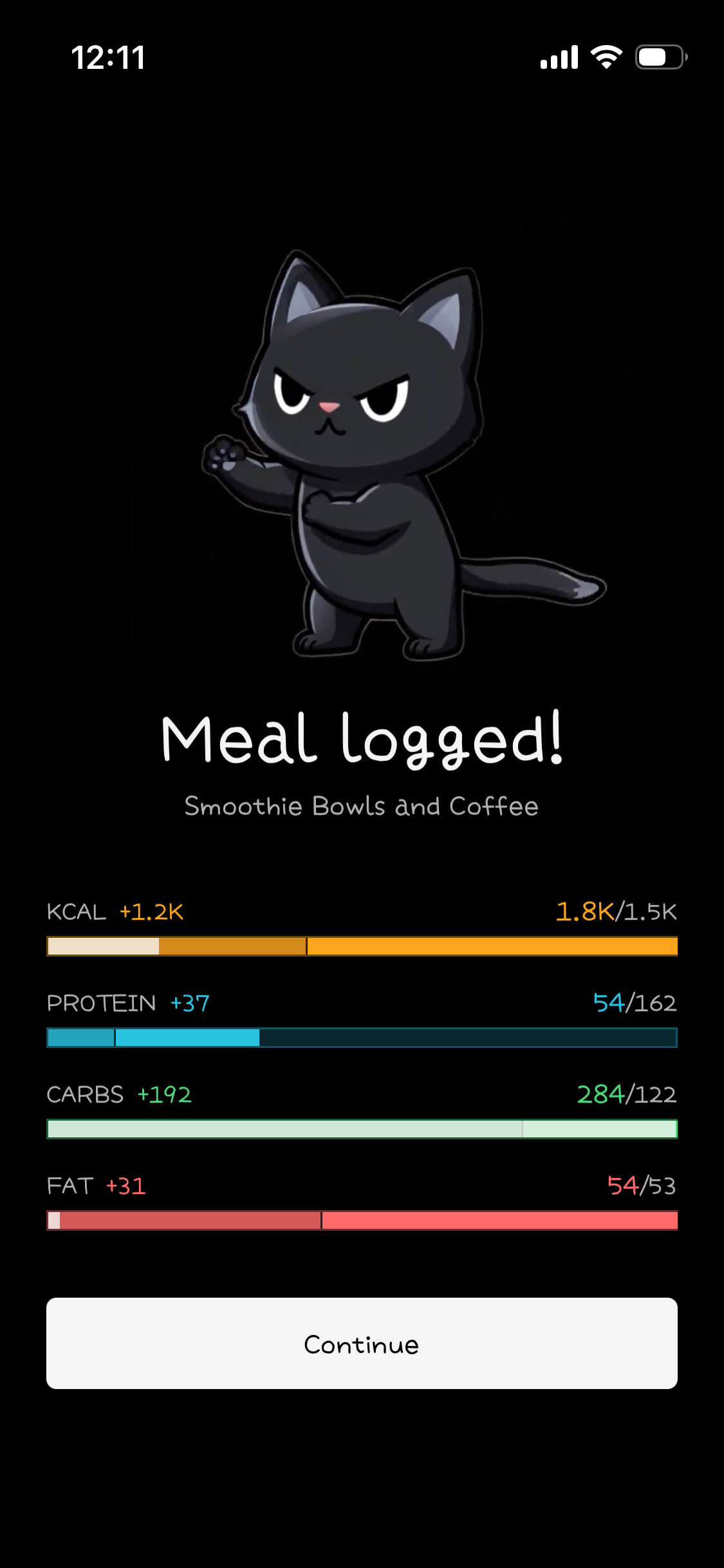
Drop redundant save success screen
I already saw the summary on the screen before. No need to show me again and have me tap continue.
Just show progress stuff while saving and auto disappearing success notification or maybe nothing at all, just close.
Log in to comment and vote
Comments3
Thibault Jan Beyer
Sep 30
I have a few ideas if that screen is too annoying:
1) you can skip the animation, so tap skip, tap continue
2) it actually all happens on the dashboard itself (no screen, animations happen live on that dashbard itself)
Georg Fritzsche
Oct 1
On the dashboard itself would be really cool.
But also not the strongest complaint, just feels like mostly the same info twice, except very cute cat animation added.
Thibault Jan Beyer
Sep 30
Hmm the first is just the meals screen, the logging only happens in that second step where you see the values VS your goals (which you don’t see before). And the idea is to give you a little cute success dopamine??
Like with duolingo after finishing a lections you get a few success screens.
Not sure, let me think about it